Kirana Club
Content and campaign creatives for India's kirana store owners: busy people who give a banner or video only a glance.
Kirana Club is a community app for kirana and small retail shop owners, mostly in Tier 2 and Tier 3 cities. They use it to discover products, check mandi rates, manage orders and find offers and schemes. I joined the content and marketing team as a visual designer, making the app's videos, banners and brand campaigns easier to notice and faster to understand.
A kirana owner opens the app between customers. They're busy, often more comfortable reading Hindi, and they don't owe any creative their attention. Generic social-media styling, with decorative layouts and clever copy, wasn't built for them.
So everything I made had to pass one test, in a glance:
Why should I stop and look at this?
- More views and engagement on video content
- Content that was easier to discover in the app
- More engagement on in-app banners
- Offers and products explained clearly, fast
- Brand-partner creatives that still felt like the partner's brand
The most important information had to be the most visually dominant. For promotional creatives I worked to a fixed order:
- 1Offer or valueWhat's in it for the shop owner
- 2ProductA real product photo, not a generic graphic
- 3Supporting infoDates, conditions, details
- 4Call to actionClear, but last
For this audience, bold type, strong product imagery and simple Hindi were usually more effective than complex or decorative layouts.
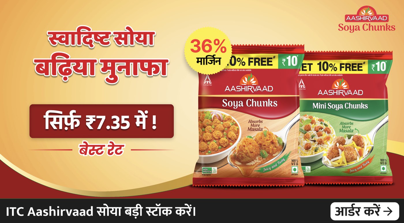
- 1Offer: only ₹7.35, and a 36% margin badge
- 2Product: the real packs, large
- 3Supporting info: best rate
- 4Call to action: order, last
I supported roughly one video or content piece a day. That pace only works with a system, so instead of designing every video from scratch I built reusable patterns for typography, headlines, product placement, backgrounds, brand elements and information hierarchy.
It made production faster and kept every piece recognisably Kirana Club, whether it was a retail tip, an offer, mandi and market updates, a trending topic or a brand message.
- Stronger hooks in the opening moments
- Bigger, bolder headlines
- Shorter messages that are easy to take in
- Hindi and simple language where it helped
- Product-focused imagery
- Thumbnails designed to be noticed in a busy feed
Banners carried offers and schemes, new products, campaigns and brand messages. For April scheme offers, like GoDesi's bumper scheme and the Zoff Haldi Loot offer, three order tiers had to be comparable at a glance. I also designed formats for the Punji reward scheme and for product and category communication.
Where past performance data was available, it shaped what to emphasise: the offer or the price, product photos or generic graphics, Hindi or English, and how visible the call to action should be.
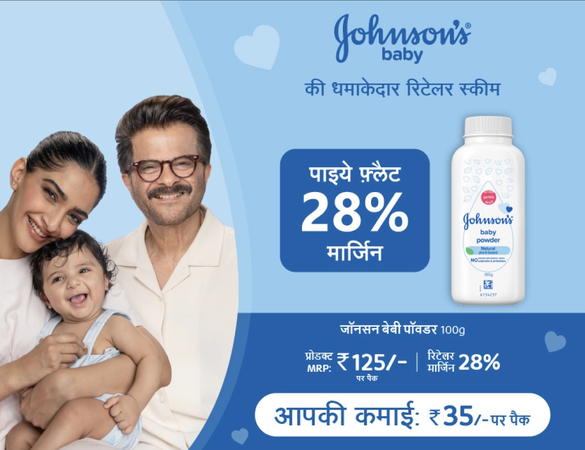
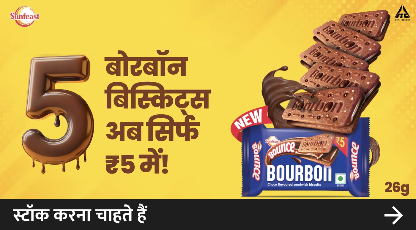
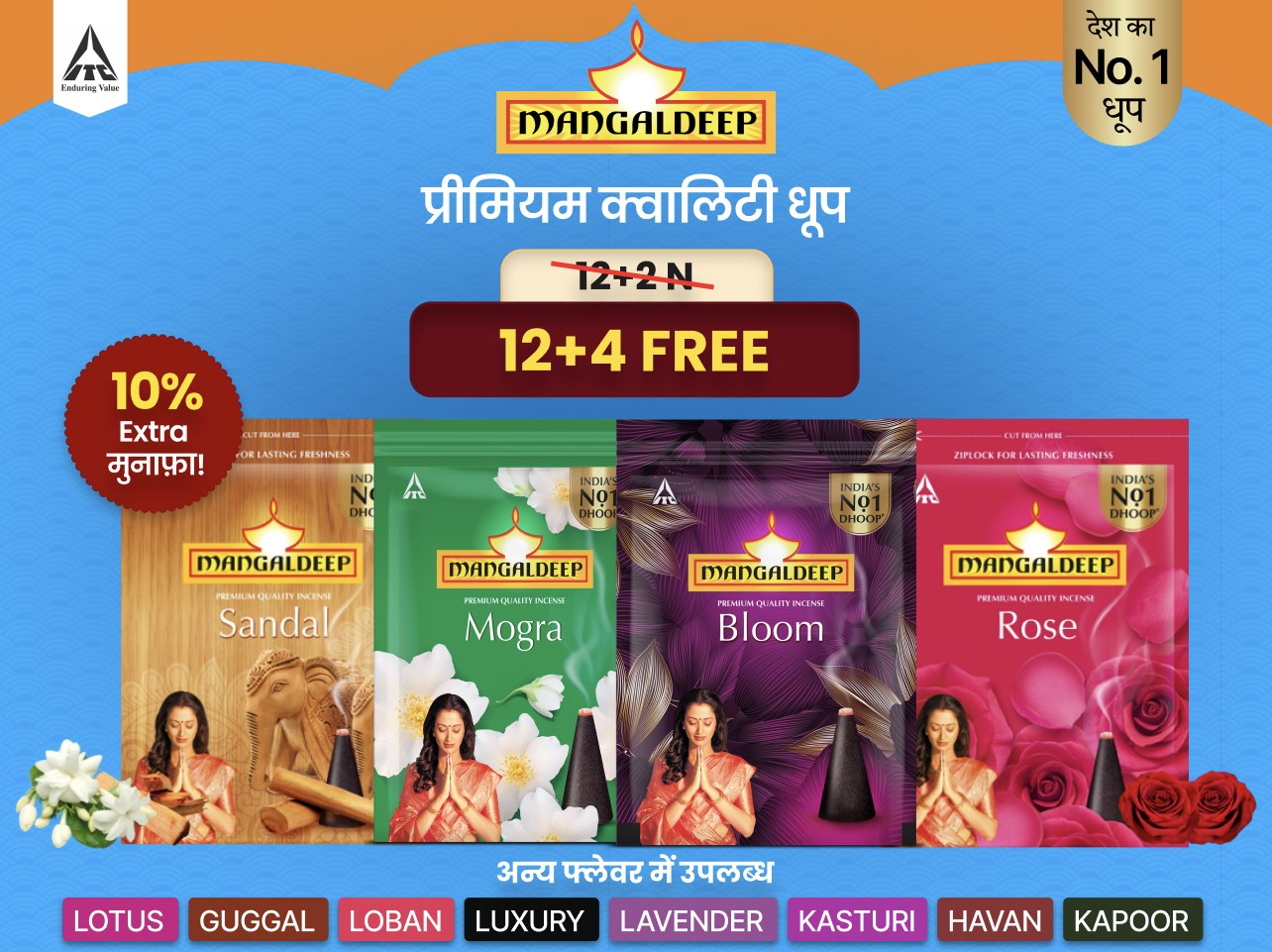
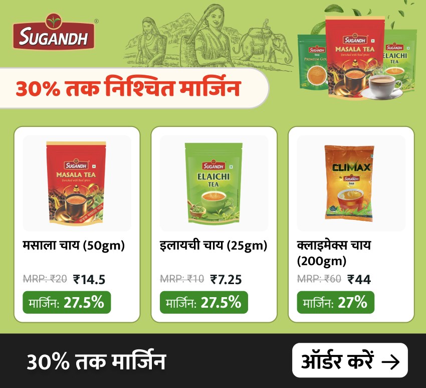
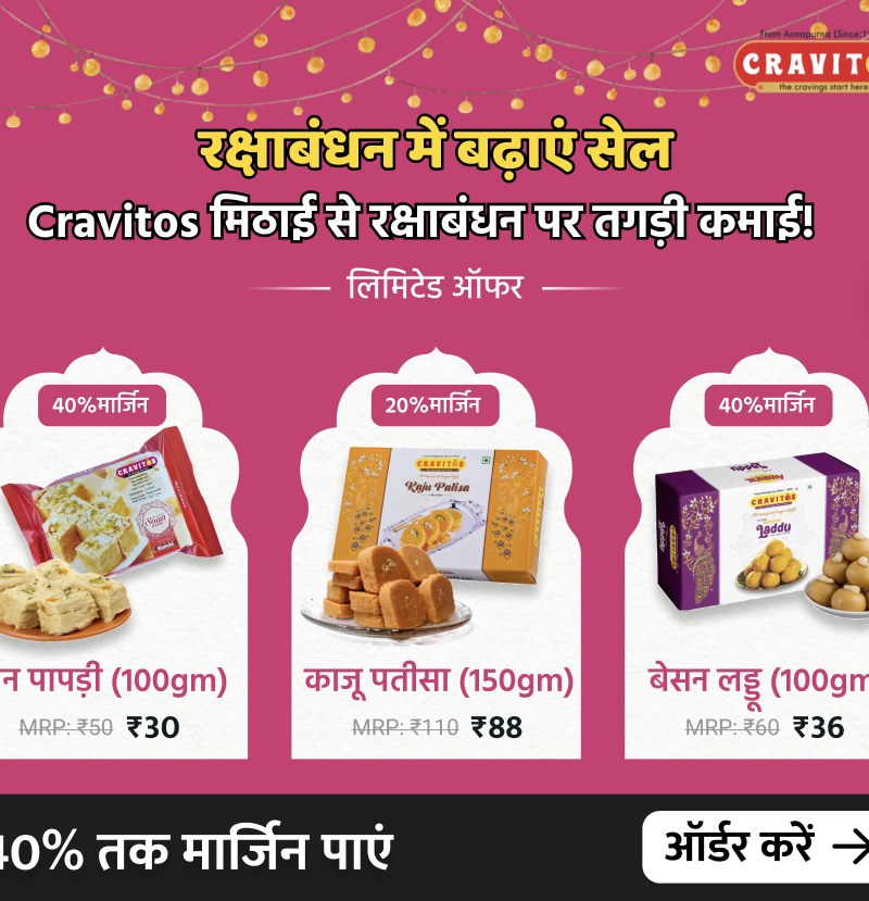
One template, two brands: Sugandh Chai and Cravitos share the same card layout for product, MRP, price and margin, and the same order bar.
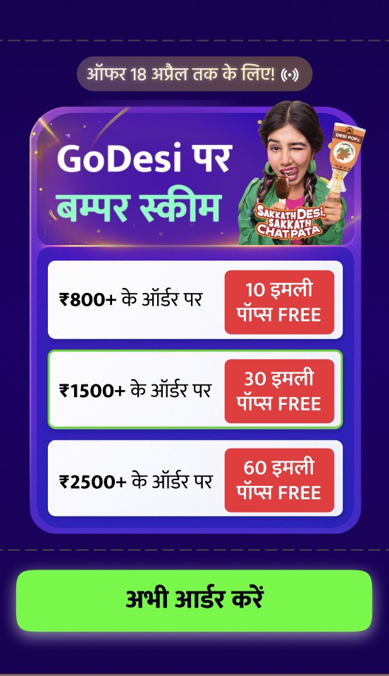
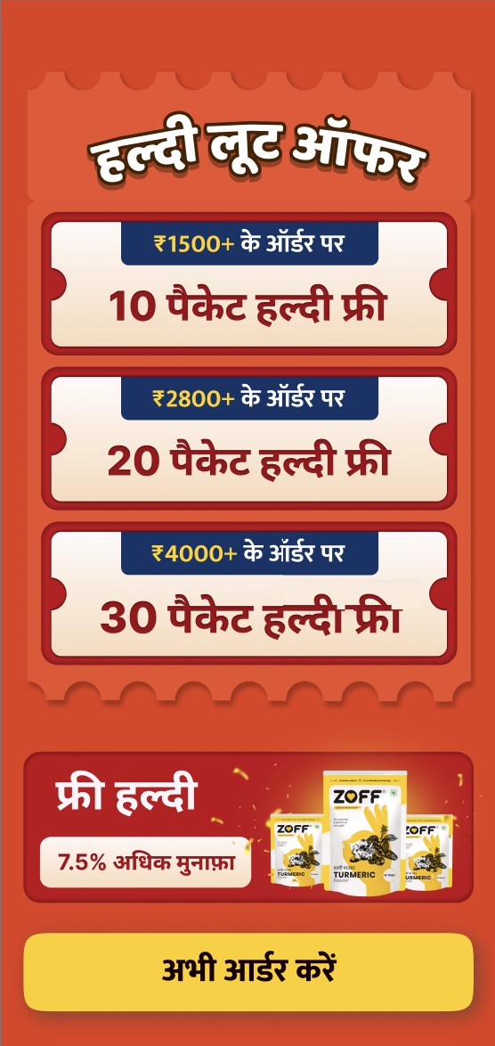
- Thresholds on the left, rewards on the right, in matching rows, so tiers compare in one glance.
- GoDesi's middle tier gets a green border, nudging shop owners toward the ₹1500 order.
- The deadline sits at the top as a small chip, the single order button at the bottom.
- Haldi Loot closes on the profit: 7.5% more, next to the product.
April schemes for GoDesi and Zoff, designed for the phone screen.
This is where the work lived: inside a busy feed, next to mandi rates, schemes and retailer posts. On a screen this crowded, a creative only works if its message lands before the thumb scrolls on.
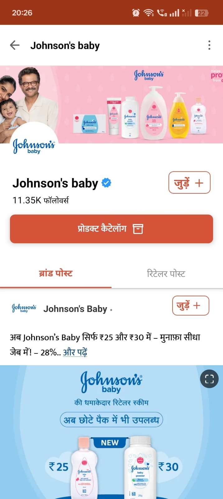
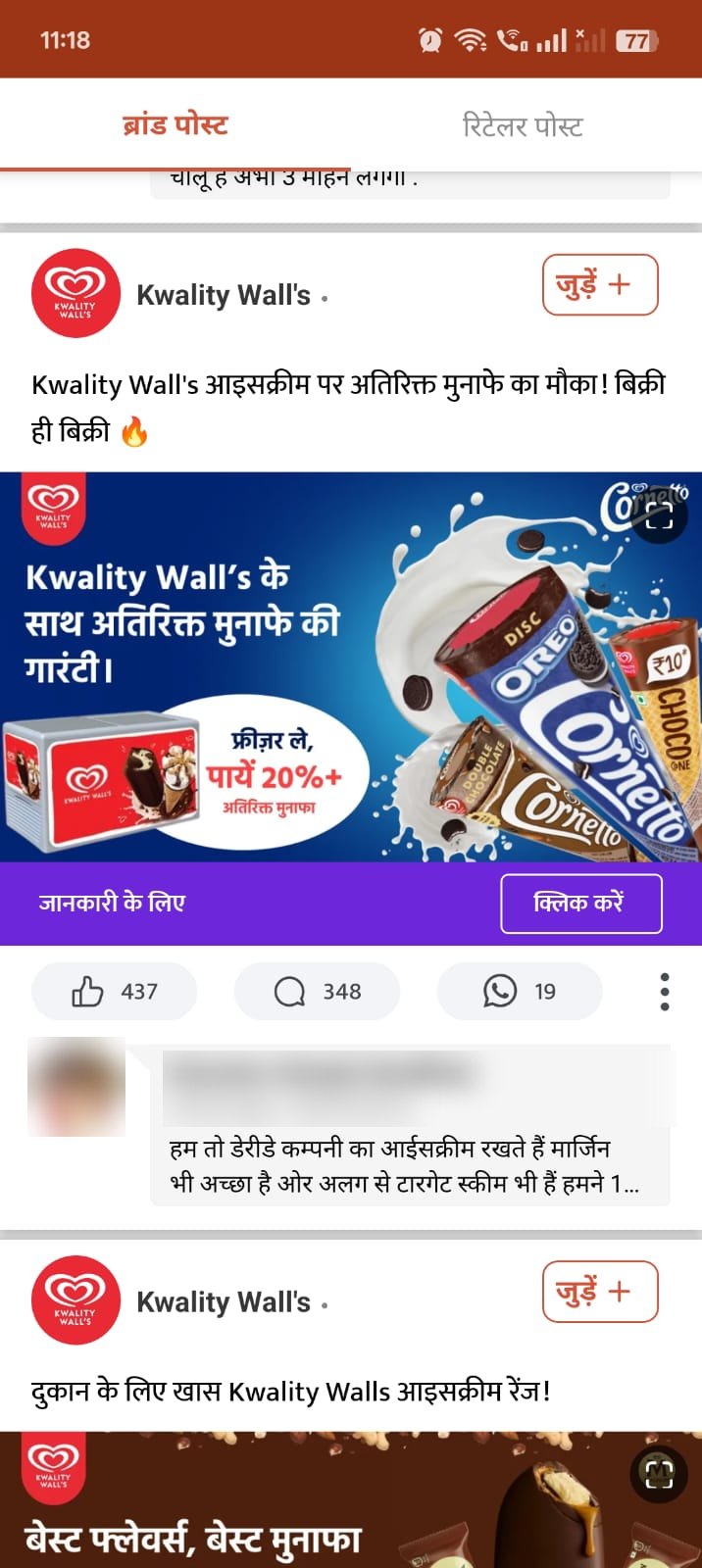
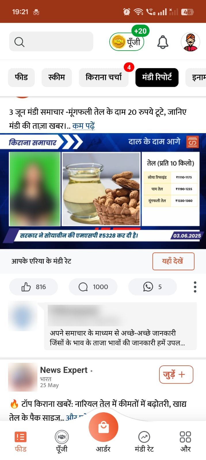
I made campaign, product and promotional creatives for FMCG and consumer brands, including:
- Aashirvaad
- Sunfeast
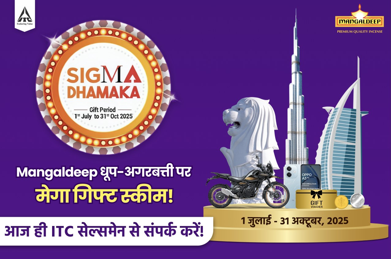
- Mangaldeep
- Johnson's Baby
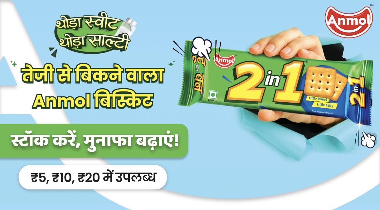
- Anmol
- Maxkleen
- Sugandh Chai
- Cravitos
- Kwality Wall's
- Chukde
- Zoff
- GoDesi
- Pansari
- Vasmol
- Somnath
- Apsara Chai
- 01Brief
- 02Objective
- 03Visual direction
- 04First draft
- 05Feedback
- 06Revisions
- 07Final
Brands supplied their product shots and campaign photography; I designed the layouts, typography and hierarchy around them. The balance in every project was the partner's own brand identity against Kirana Club's audience and communication style.
6,000 to 6,500views a day, approximately
Daily viewership grew clearly over my time on the content, reaching roughly 6,000 to 6,500 views a day. Individual posts drew real conversation too: 437 likes and 348 comments on one Kwality Wall's post, and 816 likes and 1,000 comments on a Mandi Report video. The offer and the brand matter as much as the design, but the creatives had to earn the stop first.
Designing for one specific audience changes everything. Kirana owners have little time and different needs from a typical consumer app's users, so clarity, relevance, language and hierarchy mattered far more than style. I carry that into every product I design now.